Design a pixel perfect Android app 🎨
A story of UI/UX and screenshot testing

Committed to self-improvement, driven by passion.
TDD, Unit & UI testing lover. Android Developer consultant.
Currently consulting for Deutsche Bahn, previously worked for Hermes, Check24, AutoScout24 and Pizza.de from Liferando
The success of your app depends heavily on its UI/UX.
The more popular your app becomes, the more you should care about the diversity of your users. They might speak different languages, suffer from some sort of visual impairment, or feel too much eye strain when using the app under low light conditions, etc. Thus, all these factors together influence the design of your app, and how you satisfy the expectations of different groups of users. Making your app pixel-perfect for all of them takes effort.
But that's when screenshot tests come to the rescue: they not only help automate the verification of the UI correctness, but they're also fast and simple to write, at least on Android.
With screenshot testing, you can easily verify your Android app under different configurations, i.e. user preferences, for instance:
Locales
Font sizes
Orientations
UI modes (also known as Dark/Light mode or Day/Night mode)
That's why, in this blog post, you will learn:
why it is important to test your UI under such configurations.
which libraries you can use to automate its verification with parameterized screenshot tests. No more manual testing. No more back and forth between the app and the settings.
Why testing multiple configurations matter
Locale
By localizing your app, you are making your app fit the local market conditions, lowering the cultural and language barrier for new potential customers.
Nevertheless, localizing applications is more challenging than it looks at first. Translating text itself is challenging. For instance, one word like “clear” in English could correspond to two completely different words in another language (“clear” as in “transparent”, or as in “delete”). The word needs context.
But there are many other factors to take into account:
RTL languages
Text alignment & layout direction. In general, most layouts and texts should be aligned right to left instead of left to right.
Drawable mirroring. At least, any icon indicating direction also needs mirroring to be consistent with the text flow ( e.g. icon '→' becomes '←'). The same goes for animations.
Numerals: in some locations, they use numeral systems you are not used to. The most common and conventional are the Western and Eastern Arabic numerals, but there are many other numeral systems. Use the one your users are used to.
| Numeral system | Numerals |
| Western Arabic numerals | 0 1 2 3 4 5 6 7 8 9 |
| Eastern Arabic numerals | ٠ ١ ٢ ٣ ٤ ٥ ٦ ٧ ٨ ٩ |
The list of things to take into account is very long, though: plurals, date formats, currency formats, punctuation signs for decimals, measure units, phone numbers, etc. Keep all that in mind.
Pseudolocales
If our app supports more than a handful of languages, testing app localization for every single language becomes extremely time-consuming.
You can use pseudolocales instead of the full set of supported languages to mitigate that problem.
Pseudolocales are locales that are designed to simulate characteristics of languages that cause UI, layout, and other translation-related problems when an app is translated. As stated in the Android developer's documentation 1, Android supports the following pseudolocales:
en_XA:
Adds Latin accents to the base English UI text.
Expands the original text by adding non-accented text.
Brackets each message unit to expose potential issues due to the expanded text.
ar_XB:
Sets the text direction of the original left-to-right messages to the right-to-left direction, which reverses the order of the characters in the original message.
On API < 28, it also uses Eastern Arabic numerals when displaying numbers. This is not documented though.
Spot localization issues
If supporting LTR and RTL languages, I recommend verifying your UI under at least one language for each group. For example, for an LTR language
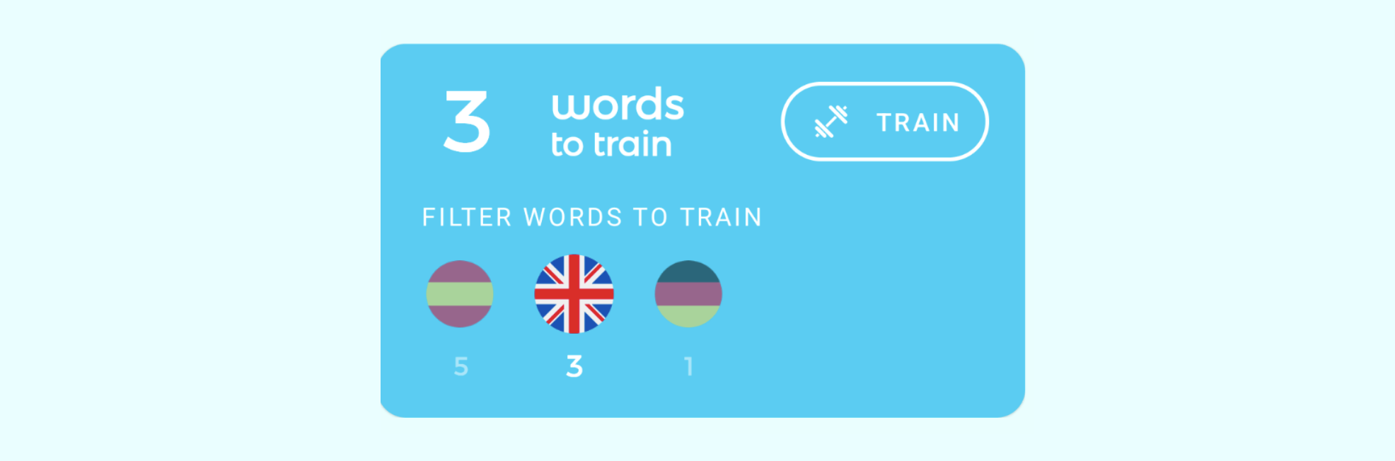
Locale "en":
✅ Everything looks fine
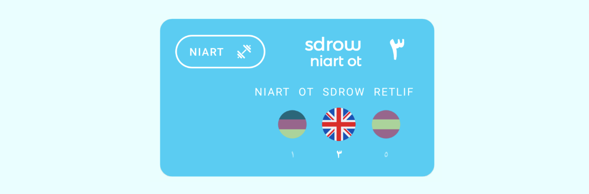
Locale "ar_XB":
Numerals are localized (i.e. Eastern Arabic Numerals for < API 28).
Layouts and texts are mirrored.
The training icon doesn't need mirroring (it doesn't imply direction).
✅ Everything looks fine
You've spotted an issue with view constraints!
Font size
The Android system comes with special settings to improve the UX for users with vision impairments. One of those settings is the font size, to enhance readability. It enables users to increase the system font size to use their phones without holding them too close to their eyes.
In an app I was working on in the past, we were tracking the font size setting of our users. The results were unexpected:
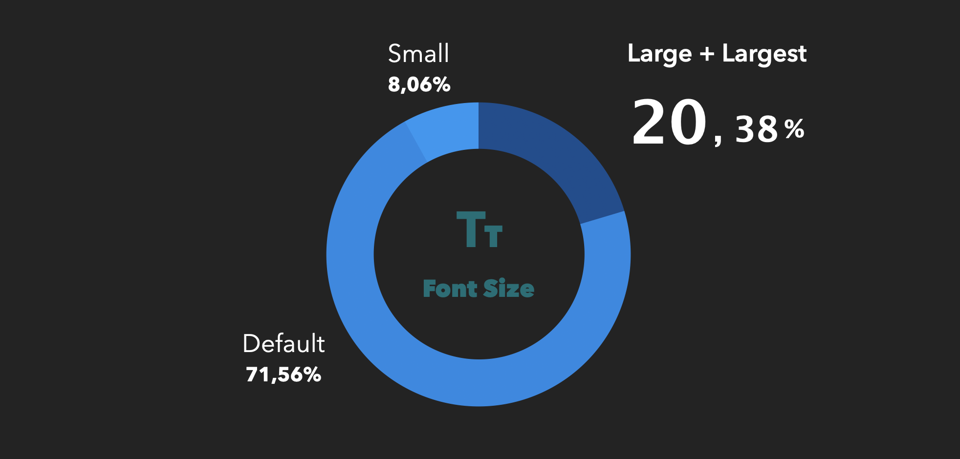
Data from a multi-banking app with 80.000 monthly active users in Germany in 2018 2.
Almost 30% (i.e. 1/4) of our users used a font size different from the default one! and more than 20% had it set to large/largest! It seems it's worth checking out what the app looks like under those settings.
Spot font size issues
If you are a developer without any visual impairment, you're likely testing your UI-related code with the default device or emulator font size. Thus, any text-related issue is quickly identified and fixed... apparently.

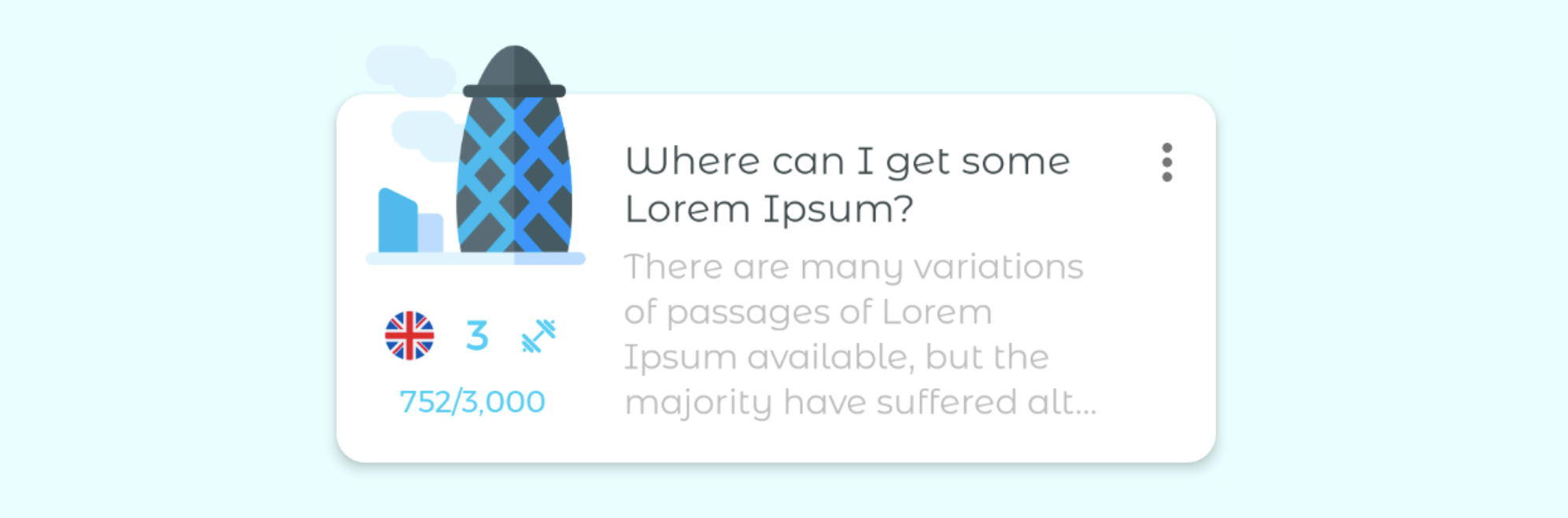
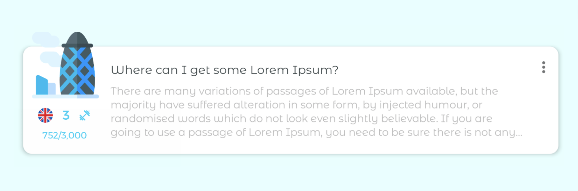
Normal font size:
✅ Everything looks fine
Nonetheless, your app probably has users with visual impairments as well. The odds are high that some of them use large or largest font sizes, which makes UI elements with text taller and larger. This might result in overlapping of UI components, text being cut off and the like.

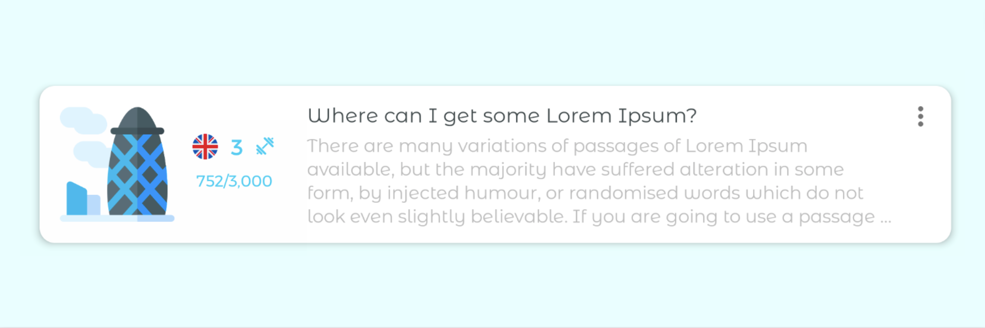
Largest font size:
Texts become taller and larger.
⚠️ Views with text look suffocated (missing padding, one word "Delete" text split into 2 lines).
A pixel-perfect app should mind those users too.
Pseudolocale en_XA vs. large & largest font sizes
Keep this in mind:
The pseudolocale en_XA makes the same text more verbose, and therefore larger.
Large & largest font sizes make the same text not only larger, but taller as well.
Orientation
Best-designed mobile apps optimize their layouts to make the most out of the available space on the screen.
This means that designers have to account for the extra horizontal space and the reduced vertical space in landscape orientation. As a consequence, some layouts might need some UI realignment or even a brand-new redesign in landscape!
Spot orientation issues
The main goal is to identify potential design improvements to better the UX in landscape orientation.
For instance, RecyclerViews might contain rows that are tall in portrait orientation. However, the screen height is greater than its width, and tall rows are fully visible in portrait orientation in most cases.
Portrait orientation:
✅ Everything looks fine
But the screen height is usually much lower in landscape orientation. That means the very same tall row takes up a much bigger percentage of the screen height in landscape. This results in many less visible rows on the screen. Although that is unavoidable, you must strive to reduce the row height in landscape orientation: if rows are less tall -> more rows visible -> users need to scroll less.
Landscape orientation:
Same design as in portrait mode
⚠️ Same height as in portrait mode but the text body takes much more space than necessary
You've spotted a potential design improvement in landscape orientation!
You could enhance its design in landscape orientation by moving UI components around to reduce the row's height, taking advantage of the extra screen width in landscape orientation. For example, you can place the image fully inside the CardView and push the flag, icon and text underneath to the right of the image. In doing so, you reduce its height because the image is not going beyond the CardView limits anymore.
Landscape orientation (optimized layout):
15% less tall than in portrait orientation while showing the same info.
✅ Minimized row height
UI mode
To optimize the UX at night, some apps come with the so-called night/dark mode. This UI mode aims to reduce the eye strain caused by the light emitted by device screens, resulting in a more pleasant experience in general. This is done by maintaining the minimum colour contrast ratios required for readability.
Spot UI mode issues
Regarding UI modes, you want to ensure that the UI components play together in harmony. So try to avoid contrast issues that might hinder reading or cause eye strain, in light mode as well as in dark mode.
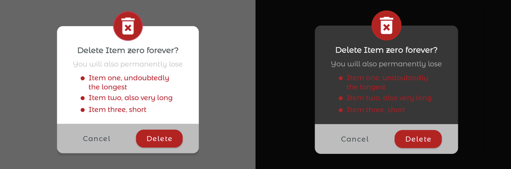
Light/Dark mode:
Same colours but the CardView has a different background colour.
⚠️ The red tone is saturated in dark mode and vibrates against a dark surface.
Material design recommends lighter tones (200-50) in dark mode, rather than default colour themes (saturated tones ranging from 900-500). You can use the recommended lighter red tone in dark mode by Material design (i.e. #CF6679) as well as a dark colour for the background of the call-to-action bar, as follows
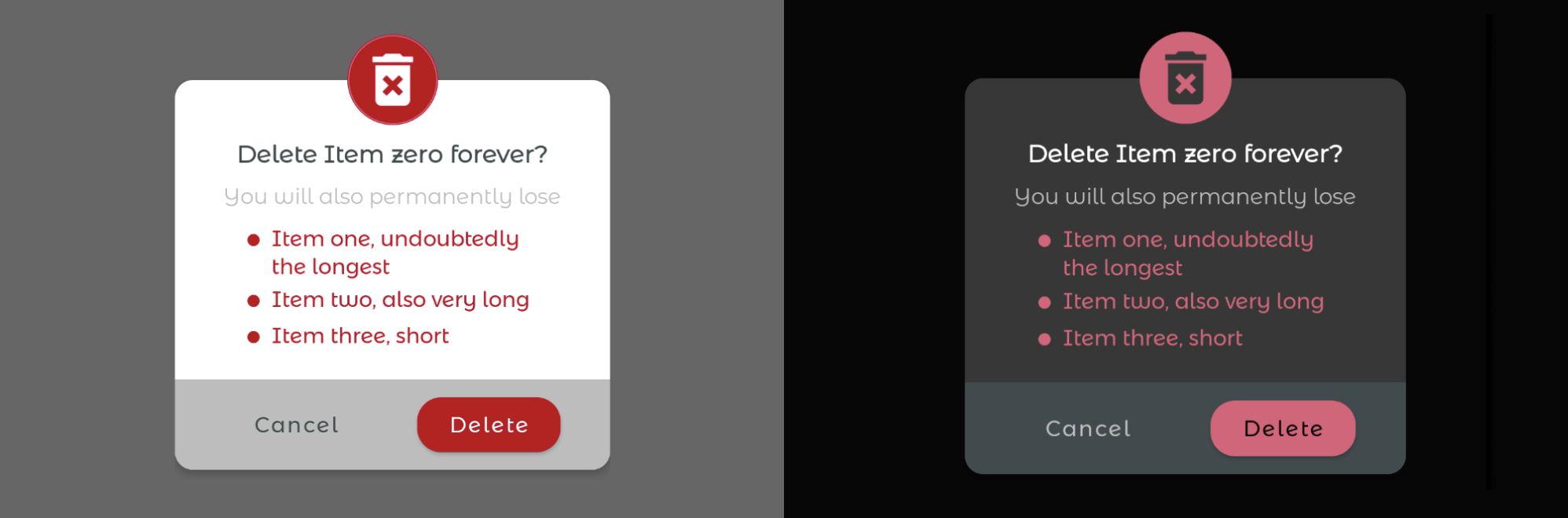
Light/Dark mode (optimized):
Lighter red tone in dark mode.
Dark colour for the background of the call-to-action bar.
✅ Good readability in dark mode.
Screenshot test'em all!
One test to rule them all
In the previous sections, you've seen how important is to test your design against multiple configurations. Nevertheless, testing every combination of settings manually looks like a nightmare...
But what if you could automate it? If you could write one screenshot test and run it under all desired configurations with parameterized tests? That's the idea behind parameterized screenshot testing!
Testing under different configurations
There are already plenty of good libraries for snapshot testing on Android nowadays.
cashApp/Paparazzi 3 and shopify/android-testify 4 screenshot testing libraries provide some out-of-the-box support for snapshot testing under different configurations.
However, Facebook-screenshot-testing 5 and pedrovgs/Shot 6 libraries, which are the most popular as of March 2022, do not. That is also the case if you're not using any library, but a custom solution for snapshot testing or simply taking screenshots while running your UI tests.
But fear not. You can still do it by using them together with sergio-sastre/AndroidUiTestingUtils 7 in your instrumented tests. The library is based on ActivityScenarios and TestRules to set all the configurations discussed in this blog post. It shows some examples of usage to snapshot test Views, Activities or Composables in its ReadMe.
Parameterization
The most flexible library to write parameterized snapshot tests is google/TestParameterInjector 8. cashApp/Paparazzi examples use it. If you search for examples with pedrovgs/Shot, take a look at Road-To-Effective-Snapshot-Testing 9. You can use google/TestParameterInjector with any other screenshot testing library in the same way.
Do you want to try it on your own?
You will find all the examples used in this blog post and more, together with their corresponding parameterized snapshot tests and other good practices for effective snapshot testing in my Road-To-Effective-Snapshot-Testing repo.
Conclusion
Making sure that your app provides the best UX to all groups of users will put you ahead of your competition.
But several configurations influence how the content is perceived by the user, and considering all of them look overwhelming at first glance.
Therefore, you've learnt, first of all, what to look for when verifying your UI under multiple configurations. Secondly, you've seen there are many tools to automate this process with parameterized screenshot tests: just one screenshot test and different configuration data are enough to test it all!
From quickly spotting visual bugs to ensuring that code changes do not break your pixel-perfect app, screenshot testing can help you with all that.
References
1 Android developers: Test your app with pseudolocales
2 Font size info pie chart: taken from my tech-talk "An introduction to effective snapshot testing on Android". You can find the videos and the slides under the following links:
3 cashApp/Paparazzi: screenshot testing without physical devices or emulators
4 shopify/android-testify: screenshot testing with Android Studio Plugin support
5 Facebook-screenshot-testing: First screenshot testing library on Android
6 pedrovgs/Shot: screenshot testing with anti-flakiness-mechanisms and handy snap view methods
7 sergio-sastre/AndroidUiTestingUtils: library to configure your Activities/Views/Composables under different configurations via ActivityScenarios and TestRules.
8 google/TestParameterInjector: a Junit4 and Junit5 test runner that supports parameterized tests in a flexible means.
9 Android-screenshot-testing-playground: project containing screenshot tests for all the examples in this blog post and more, as well as additional tips for snapshot testing effectively
Further Reading
You can find the other articles on snapshot testing of this series here!


